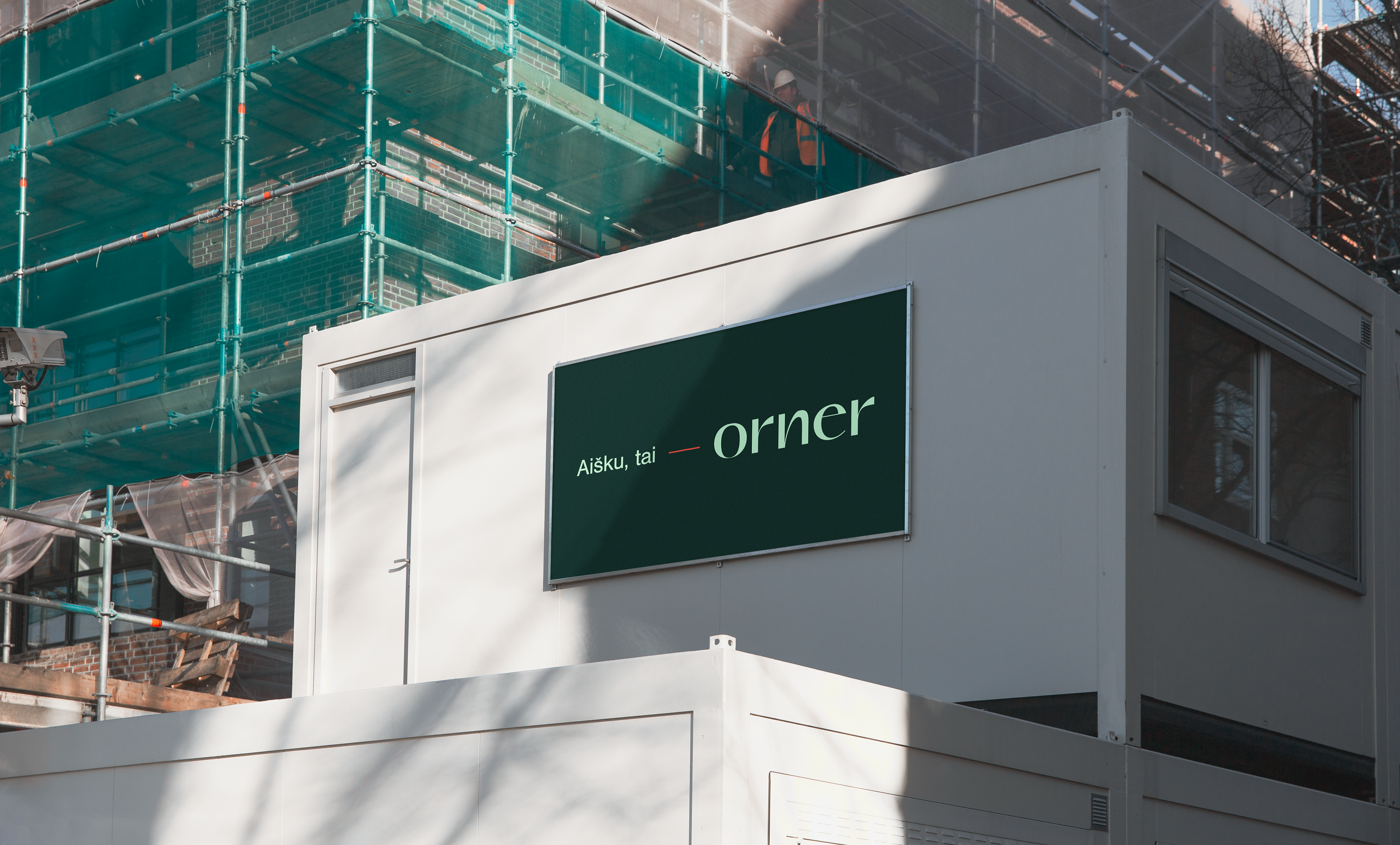
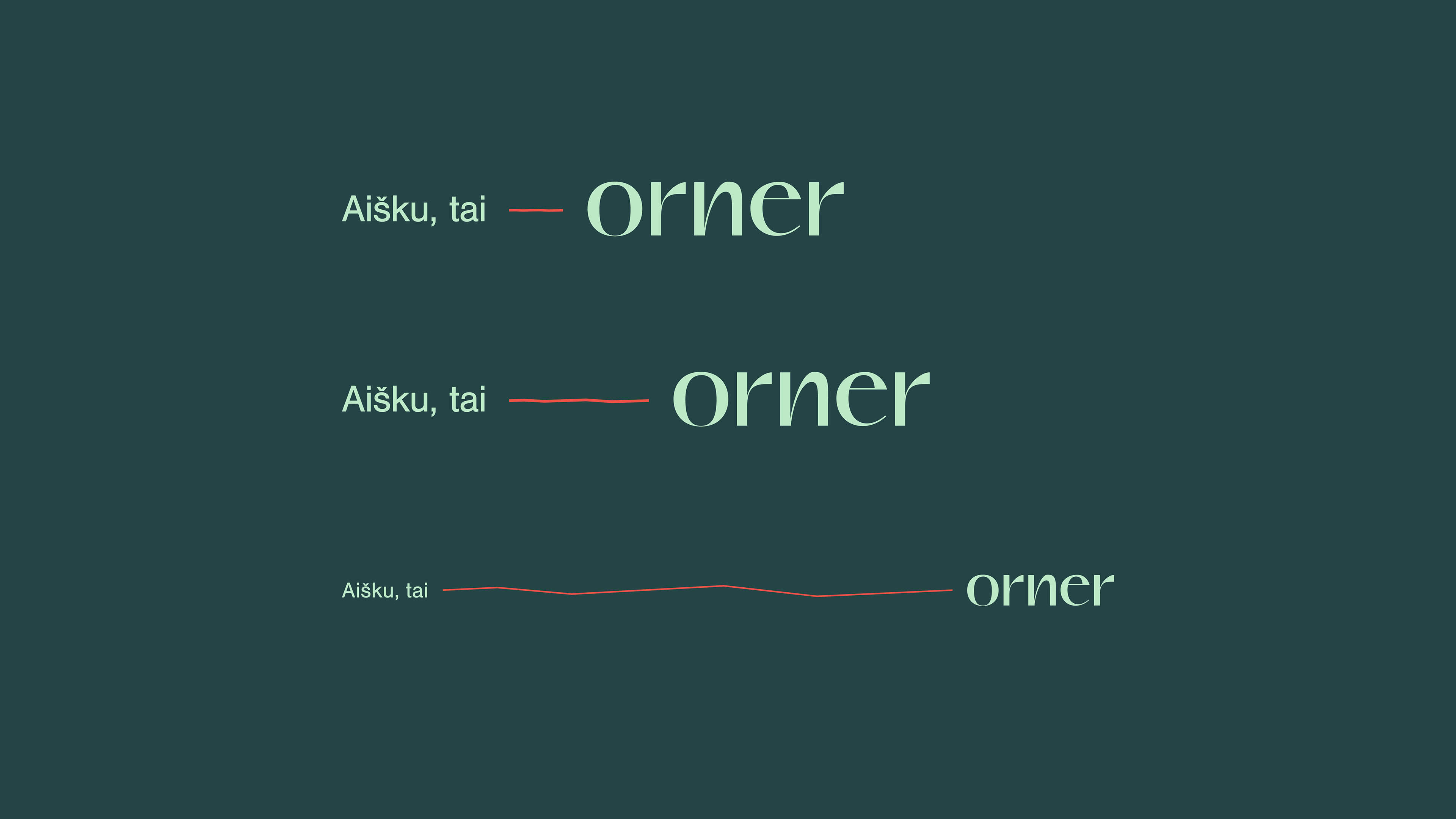
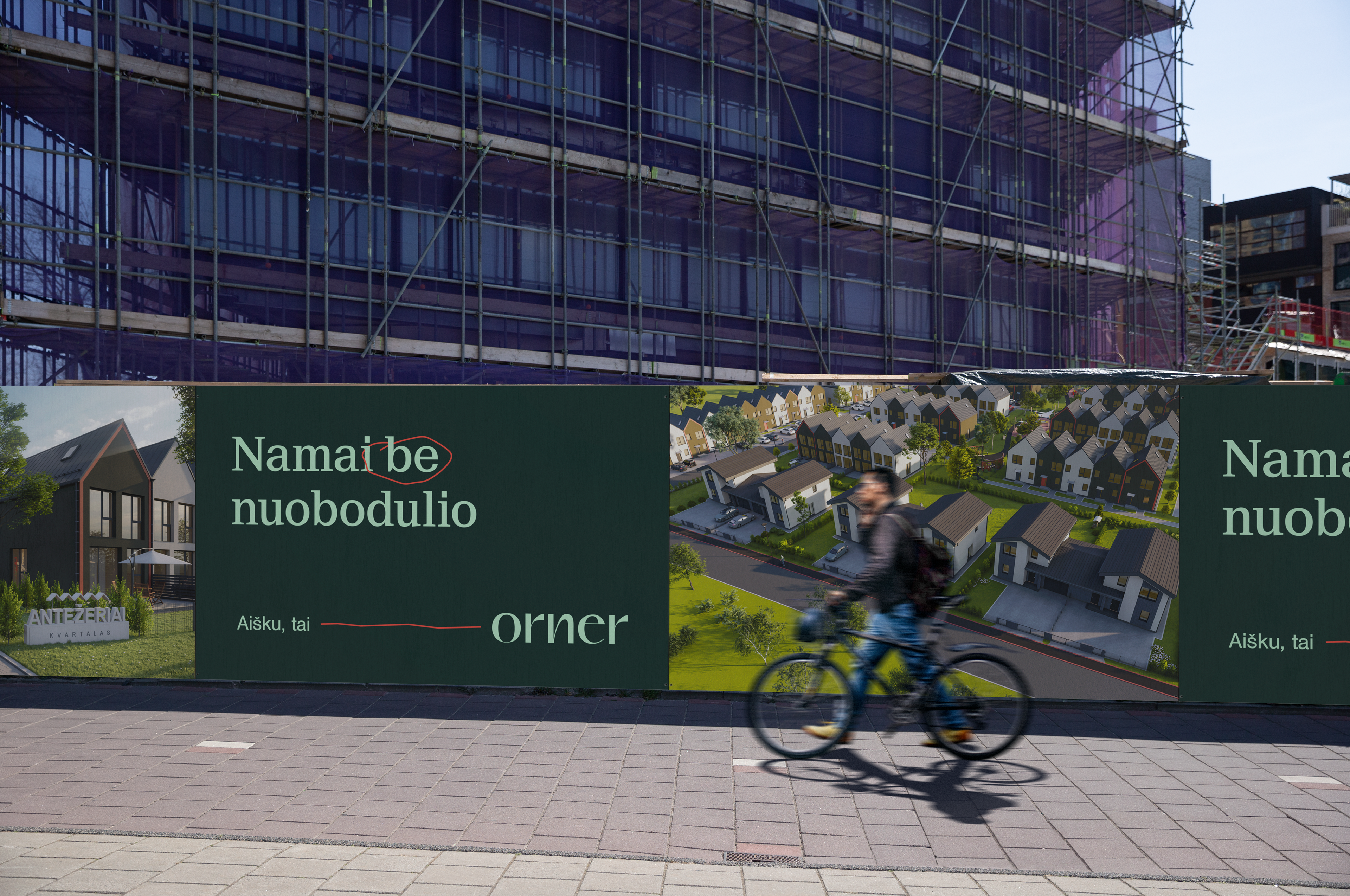
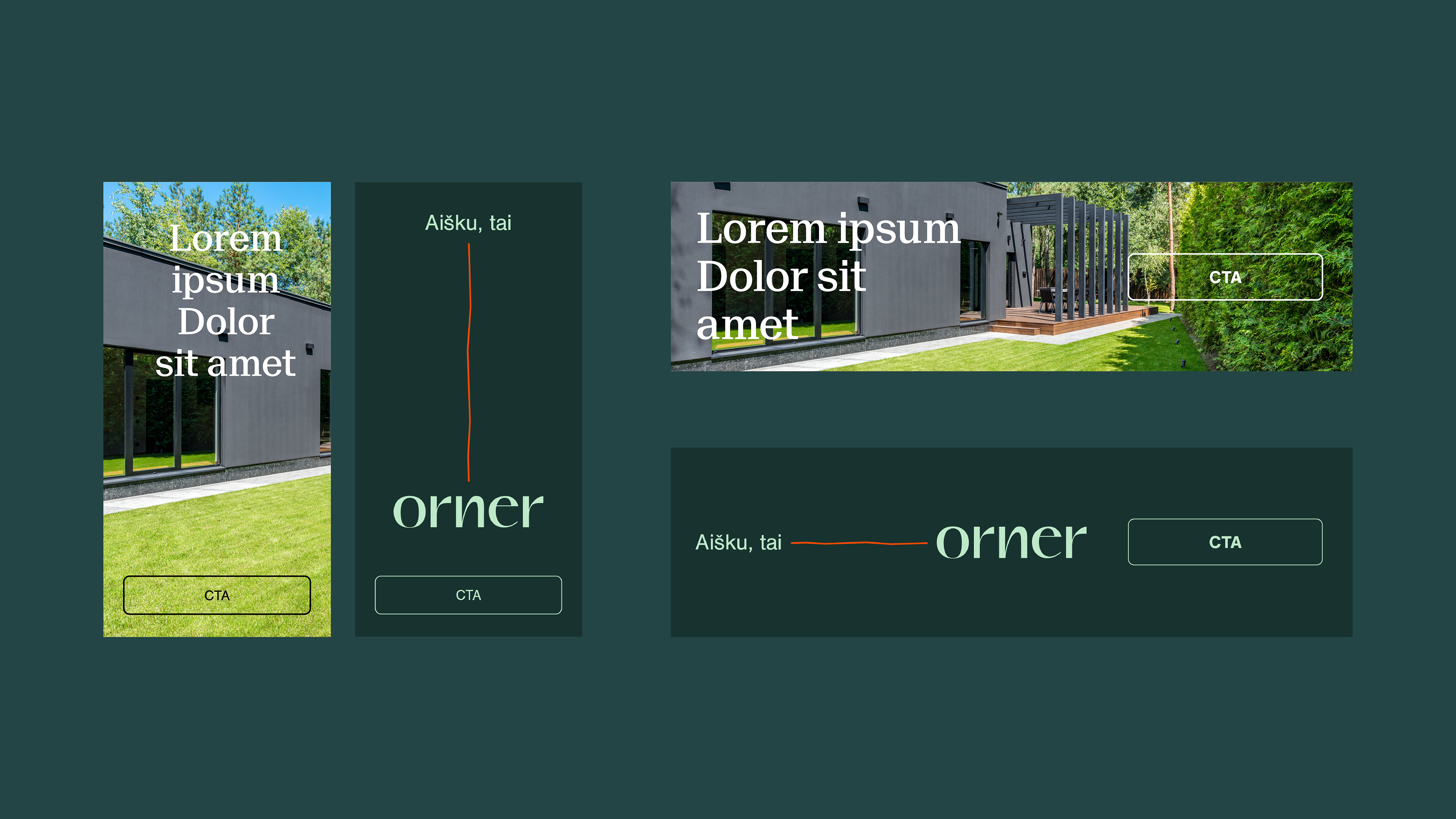
ORNER - our latest brand identity for a real estate development company. New naming, logo and visual identity. The name ORNER comes from two words of Hebrew origin, creates the meaning of striking beauty.
ORNER - "light-carrying arrow".
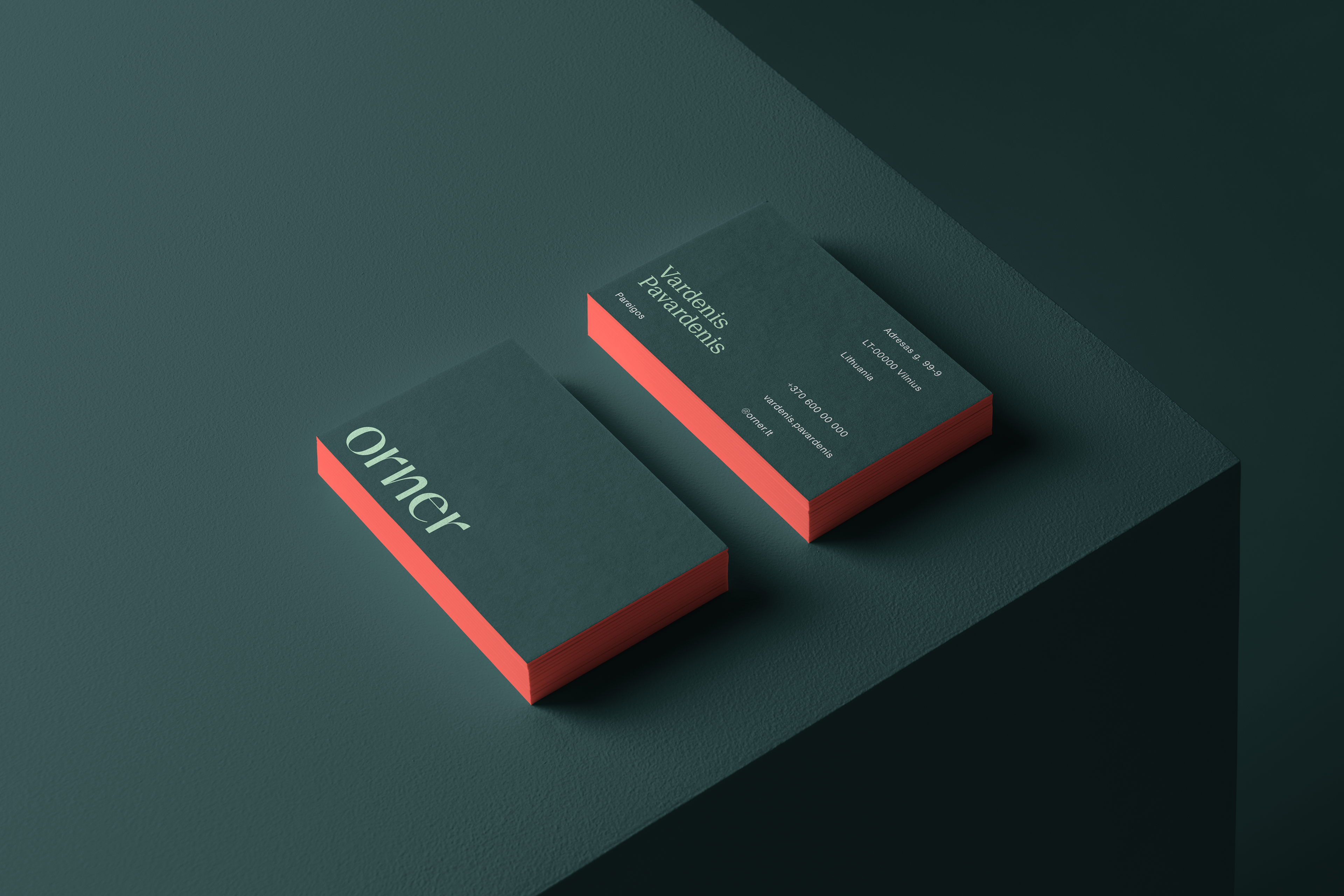
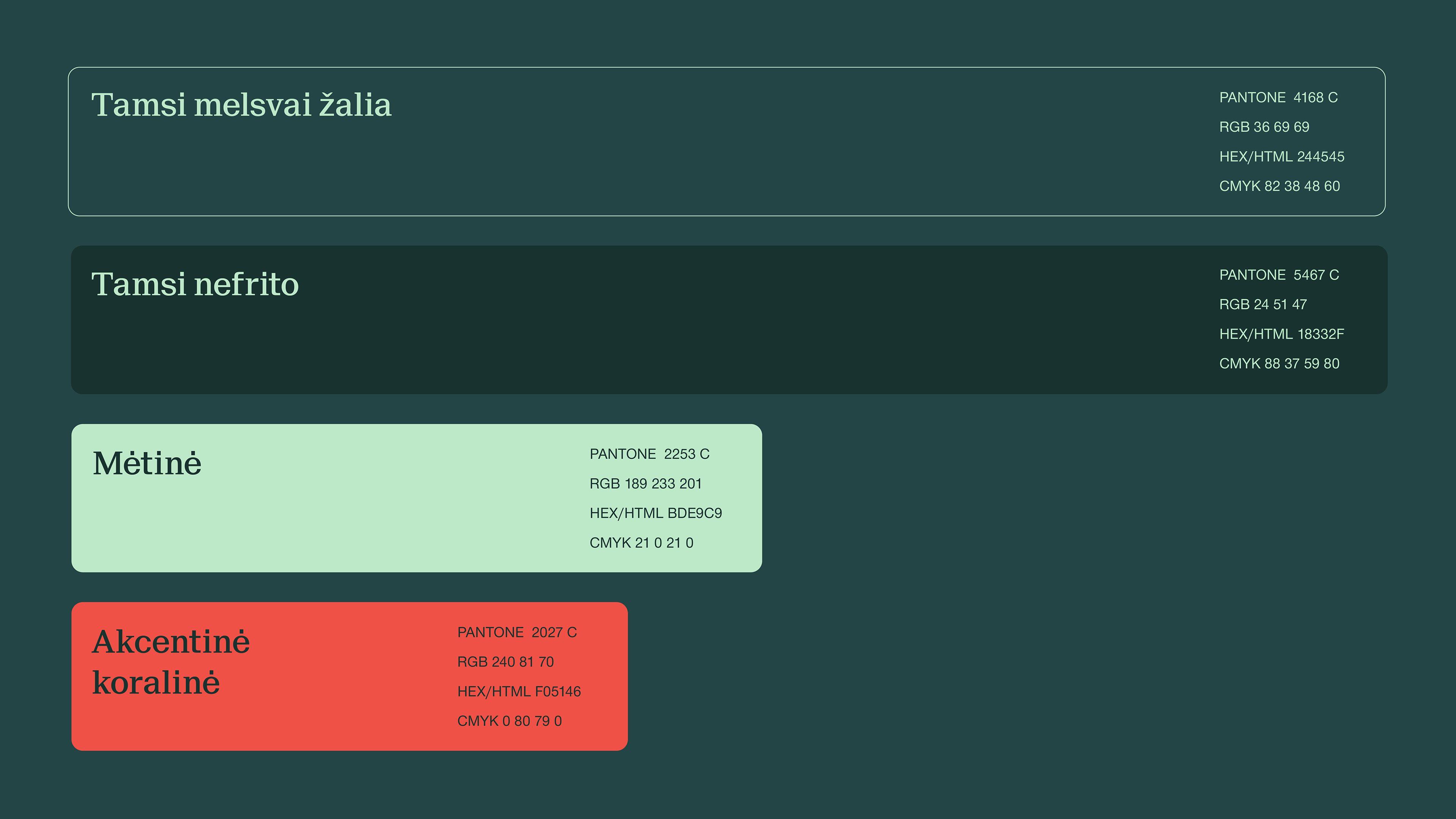
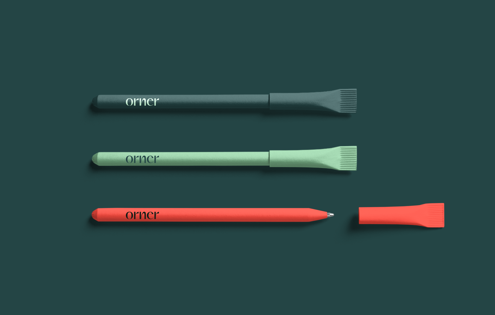
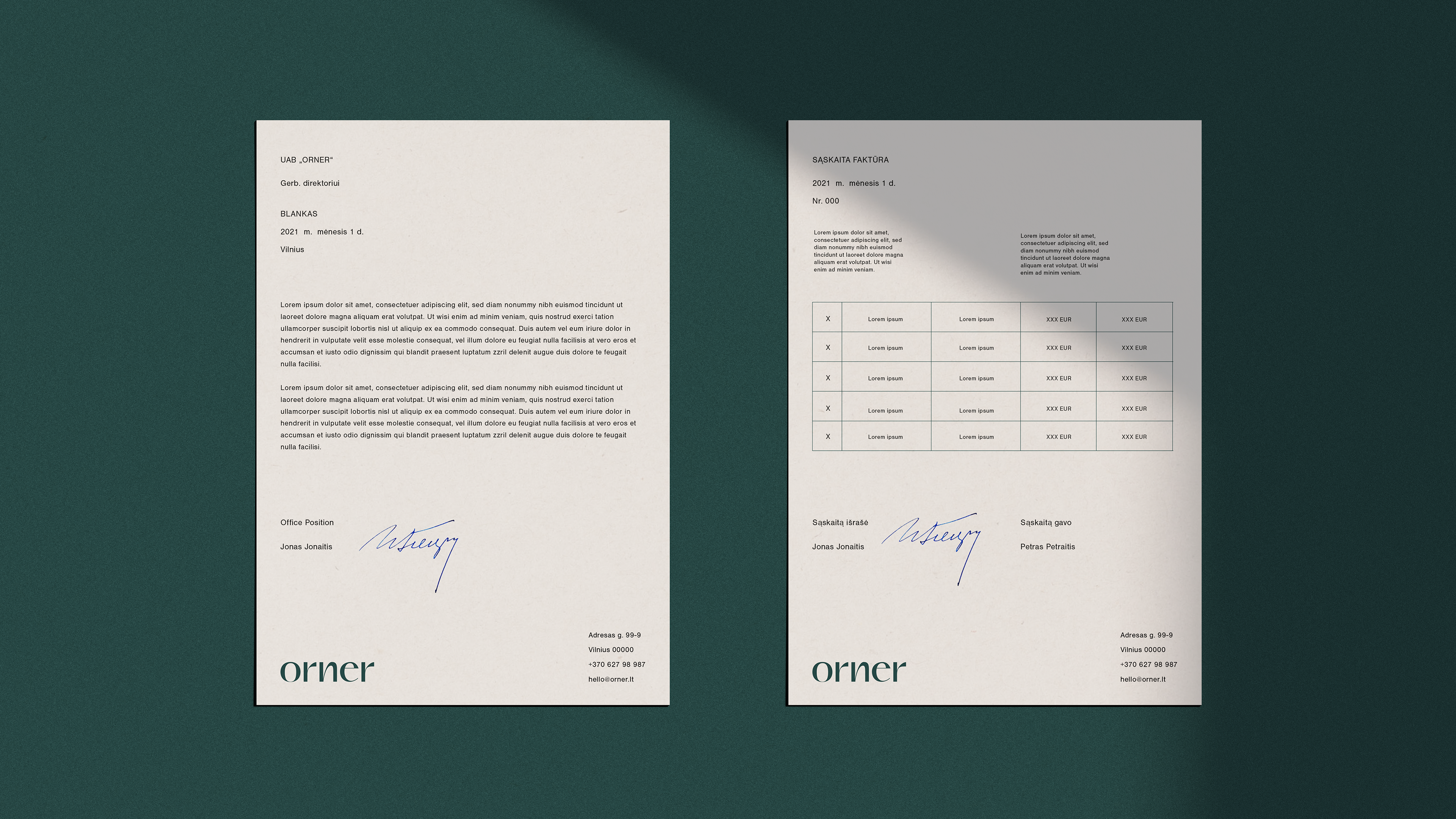
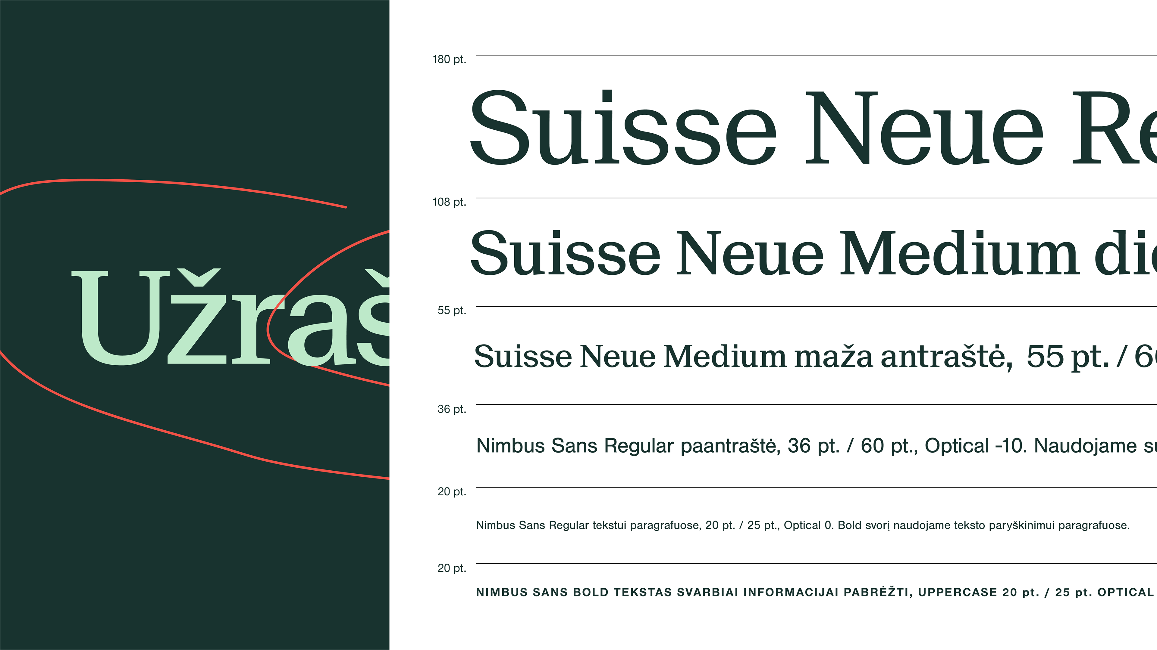
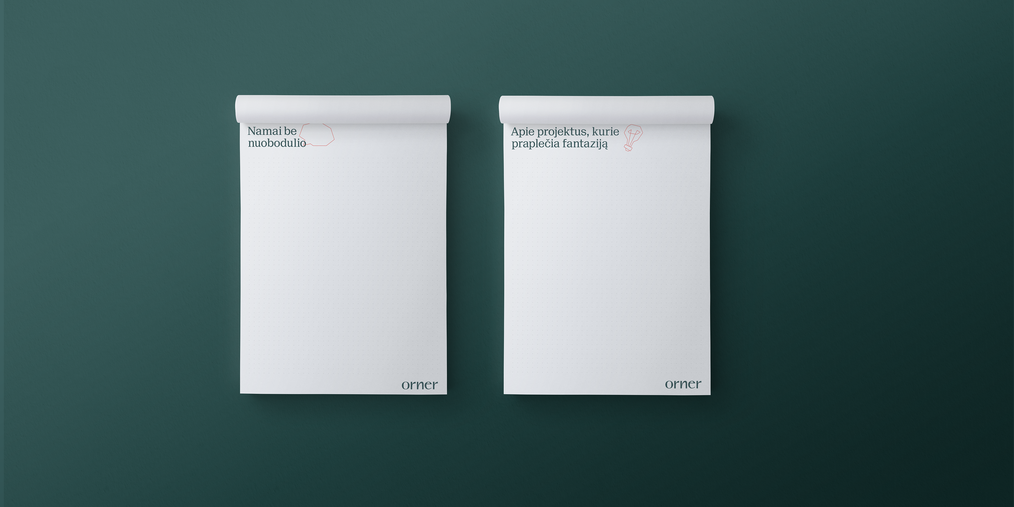
Modern typography, deep emerald color combination with coral orange, surprisingly bright, fresh look. Typographic systems are simple, restrained and clear. In colors (deep green), we communicate reliability, trust.
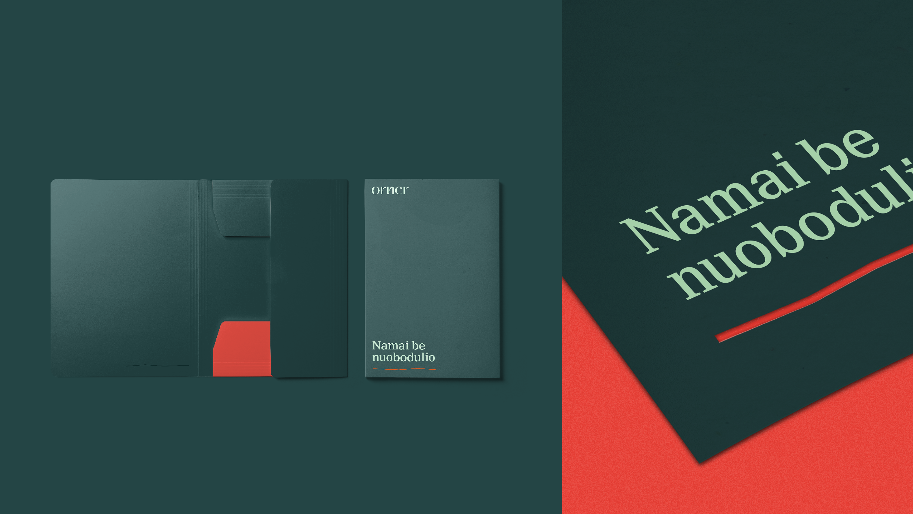
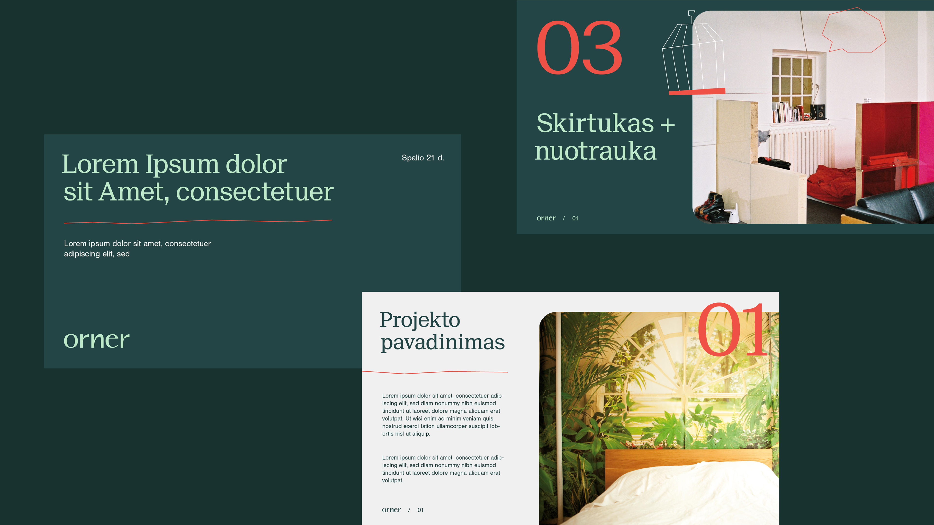
We use accent color (coral) for brightness. We choose a friendly, direct illustration and its fragments. In the context of Lithuanian real estate brands ORNER will never be corporate and boring. The positioning of this brand - the homes for a life without boredom.
Concept: Mãrios Positioning Hungry Scout
Naming: Renata Šarkauskaitė
Art Direction: Marius Kneipferavičius
Branding Design: Gintarė Baryzaitė